The Context
The Emory Student Centers are the living room of campus life — a network of three facilities serving 33,000+ students, staff, and faculty through programming, events, and everyday community. The Emory Student Center (ESC), Cox Hall, and Alumni Memorial University Center (AMUC) each have their own character, their own audiences, and their own physical environments. The visual challenge was consistency without homogeneity: every asset needed to feel like it belonged to the same system, while still working in context.
I produced 100+ design assets across the full scope of the Student Centers' communications operation — digital signage, printed posters, social media graphics, YouTube thumbnails, wayfinding signs, nameplates, event collateral, and hiring materials. Every piece had to balance Emory's institutional brand guidelines with the warmth and energy the Student Centers are known for.
What I Designed
The work spanned four overlapping categories, each with its own constraints and audiences.
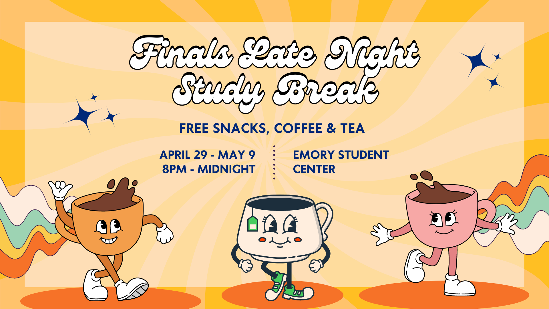
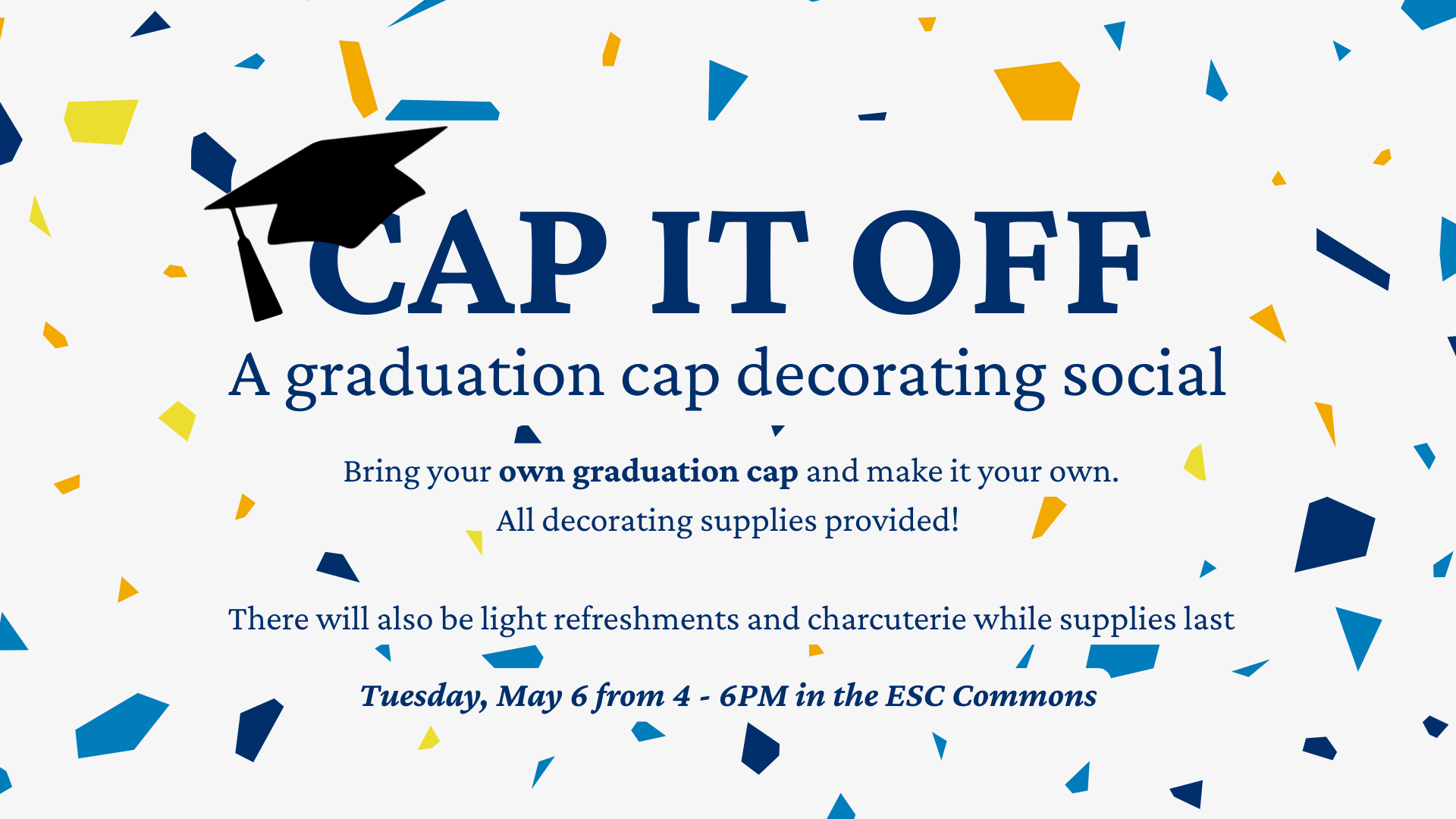
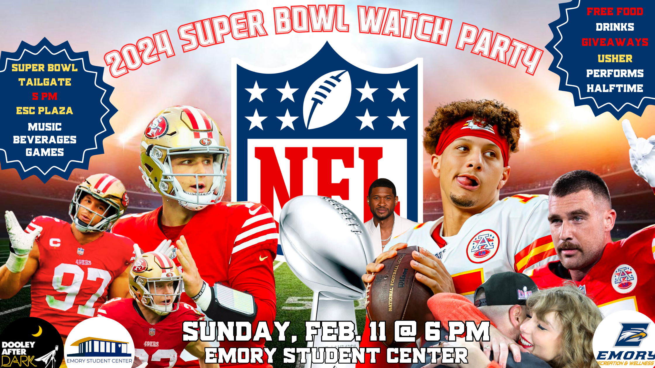
Event Marketing & Digital Displays
Campaign assets for recurring and one-time events — from finals week study breaks to vendor expos to graduation socials. These ran on the ESC's on-screen display network, Instagram, and in-building printed posters. Each campaign required versions at multiple aspect ratios: 16:9 for digital displays, 9:16 for vertical poster formats, and square crops for social.
Wayfinding & Facility Signage
Physical directional and informational signage across three buildings — office nameplates, out-of-order notices, entrance directionals, and floor directories. These required strict brand compliance and print-ready resolution, often under short turnaround from request to installation. The BCJ staff directory alone mapped out six departments and a dozen room assignments.
Recruitment & Institutional Materials
Hiring flyers and professional collateral for the Student Center Ops & Events team, distributed via LinkedIn and campus channels. These had to speak two audiences simultaneously — campus community members and external job seekers — while maintaining the same visual identity as the event materials.
Program & Event Support
Printed programs, speaker flyers, and welcome signage for events hosted in the Student Centers' facilities by campus partners. These required design sensitivity to external audiences — adapting the Student Centers' visual language for contexts that weren't always ours.
The Process
Most assets started in Canva for rapid templating — especially for recurring formats like the on-screen display series and social posts where speed and consistency mattered more than pixel-level customization. For more complex pieces — the BCJ staff directory, event posters with custom compositions, print-ready signage — I moved into Adobe Creative Suite to get the fidelity and resolution the output required.
The real design challenge wasn't any single asset. It was maintaining coherence across dozens of formats, contexts, and turnarounds while adapting to whoever the event or communication was serving. A finals study break poster needs to feel different from a hiring flyer. A directional sign for the CCE entrance needs to be immediately legible, not clever. The system held because I kept the color palette, typography, and logo usage consistent even when the visual tone shifted dramatically.
Selected Work
A selection of assets produced for Emory Student Center Operations & Events. All work produced in a professional capacity as part of the Student Centers team.
We Are Hiring — Student Center Ops & Events recruitment flyer distributed via LinkedIn and campus channels. Designed in Canva.
What I Took Away
Designing at scale inside an institution teaches you something that client work doesn't: brand discipline under time pressure. You're not always working with clear briefs or generous deadlines. Sometimes a sign needs to be printed and installed same-day. That environment sharpens your instinct for what's essential — which element carries the communication, which design choices can flex, and where the non-negotiables live.
It also reinforced how much visual design is really audience design. The students who need a finals study break reminder at 11pm on a Tuesday don't want the same thing as the department head reviewing a hiring flyer for LinkedIn. Reading the audience, then building the asset that works for them — that's the actual skill. The software is just execution.